Monday, 15 February 2016
Wednesday, 10 February 2016
QUESTION 3 WHAT HAVE YOU LEARNED FROM YOUR AUDIENCE FEEDBACK?
QUESTION 3 SCRIPT
I will be discussing how my audience
feedback has impacted my media products, and what I have changed in order for
my music video and other products appeal to my target audience. Throughout out
the process of researching my media products I have used audience feedback by
using social media sites in order to gain an understanding of what my target
audience is looking for. When coming up with an initial idea it was crucial for
me to understand the nature of my target audience and the type of music video
they would expect to correspond with my chosen track. During the process of
coming up with an idea I used focus groups and social media sites to gain an
understanding of what my audience will be looking for I carried out these focus
groups in different forms, for example giving hard copies of surveys and
questionnaires. This made the feedback process more efficient and practical,
enabling me to analyse and understand what my target audience is looking for.
The information that I gained through my
research included my target audience’s age and tastes which helped me when I
continued further planning for my media products. It is important to establish
the type of people who you are trying to reach out to, to create a successful
product that will please my target audience. Through conducting this form of
research, I was then able to carry out more focus groups on a specific target
audience, as I had a greater understanding of the demographic that my target
audience were a part of. When carrying out further research it was notable that
the demographic that I was targeting was the ABC1 group, including middle class
men and women from the ages 25-50. From this information I was able to receive
more accurate and exact information that would help me carry out more planning
for my final products.
When I conducted my first focus group I
sat down with my target audience and played the track, People are strange by
the doors. After I played the track to my focus group I asked my target
audience to write down a few keywords that came to mind when they listened to
the track. From the focus groups that I conducted I was able to brainstorm in
detail further ideas for my music video and ancillary tasks.
Before I started to film my music video I
decided to act on a few ideas that I had in mind, such as the screen projector
idea. I used social media to gain some audience feedback on whether I should
carry out this idea for my final product. Although my audience suggests that
this was a good idea, after planning and developing my initial idea, I did not
follow through with this idea. This shows how, some of the feedback hat was
given was ignored.
Using YouTube to upload the progress of my
music video was very helpful, as it allowed me to conduct more focus groups. I
played the first half of my music video to my focus group, and asked for their
feedback. I found that by playing to my focus group the unfinished music video
I gained a lot of negative feedback on the lighting and editing of my first
draft. Consequently my target audience gave me feedback and advice on how I
could improve my music video negative feedback that I gained included the
lighting and editing of the unedited music video. From this feedback I went
away and re-edited my music video to fit the tastes of my target audiences.
This process has taught me that gaining audience feedback verbally is crucial
when improving any media product that I create
In addition to gathering audience feedback
for my final product I also received audience feedback for my ancillary task.
Like my main product, I used a survey and questionnaires to find out what
my target audience would like to see on a CD cover and poster. My audience
suggested that I express the importance of my artist on the front cover of the
digipak and poster, as they liked the artist’s persona and felt that it was an
important aspect of the final product. I followed through with this advice and
included the artist on the front of my poster.
However, during the editing process of my
ancillary task I did not follow through with the comments that my target
audience had made. For example when deciding on a font to use for my digipak
and poster. My audience suggested that I use font b for the front cover of my
digipak, due to the vintage style that the font portrayed. Although when I
attempted to use this style during the editing process, I disliked the way it
looked and therefore decided to change my idea. This therefore shows that I did
not follow through with some of the advice that my target audience gave to me
via Facebook. In the future when I create more media products I will make sure
to take more care when analysing my audience feedback, as the way my audience
may perceive a certain style or idea may not fit with the initial idea that I
had planned. It is also important to note that the majority of respondents of
my audience feedback are only of a minority compared to the large scale of the
over demographic. I also had to take into account the current style of CD covers
in today's music industry, avoiding my CD and poster to appear dated.
When I redrafted the design for my digi
pack and then decided to send my sketches to my target audience via iMessage to
gain some feedback. The feedback that was said was successful.
After I created my products is decided
that I wanted to show my target audience the final outcomes and hear what they
had to say. I used what to share my music video due to the controversial
subject that my video includes; I did not want to share my video on a website
like Facebook.
My audience gave me plenty of positive
feedback regarding the how clear and current the narrative was to today’s
issues in society. My audience suggested that the video could provoke much
attention in a positive way. They also touched on the technical skills that I
used in the music video such as editing and camera angles.
I did however gain some constructive
criticism. The main criticism was the fact that I did not show the main
character applying the makeup, some of my audience suggested that if I had done
this it would have given the narrative a clearer ending and finish off the
story.
I used face book to gain feedback of my
digipak and poster products. I was surprised at the amount of positive
feedback that my audience gave, as I did not construct as many focus groups as I
did for my main product. Positive comments included, interesting
professional. However some of my audience suggested that
the spacing and placing of the text around the main artists was hard to read and
the font was hard to read.
Over all, throughout the process of
creating all of my media products, audience feedback has enabled me to think in
a more critical way about my work, and to adjust to what my audience would like
to see from me. Using focus groups to understand how my audience would like me
to change my music video was useful, as my audience encouraged me to change
parts of my music video which would improve my product.
Monday, 8 February 2016

Saturday, 6 February 2016
Tuesday, 2 February 2016
QUESTION 1 PART 1
IN WHAT WAYS DOES YOUR MEDIA PRODUCT USE DEVELOP OR CHALLENGE FORMS AND CONVENTIONS OF REAL MEDIA PRODUCTS?
In part one to this question I will be discussing how my music video has developed or challenged the conventions of real media products, in the form of a video. I will be narrating my thoughts and feelings in response to the question provided, and I will be uploading the final part to the question shortly after this response.
PART 1
Monday, 1 February 2016


AUDIENCE FEEDNACK ON MY FINAL PRODUCTS (ANCILLARY TASKK)


Saturday, 30 January 2016
Thursday, 28 January 2016

Tuesday, 26 January 2016
TRACK LISTING IDEAS
To complete my back cover, I had to construct a track list for the back cover of my digipak. I decided that I wanted to use track names that would reflect the star image of my artist, and the genre of the artist. I researched into existing track listings from band such as the doors, joy division, and David bowie.
I wanted to relate to the strange element of the album, by doing so I want to include the word strange in more than one of my tracks.
TRACK LISTING
I wanted to relate to the strange element of the album, by doing so I want to include the word strange in more than one of my tracks.
TRACK LISTING
- SANITY OF A DIFFERENT KIND
- PEOPLE ARE STRANGE
- ORCHESTRAL HEMO GLOBIN IN MY DREAMS
- HOUR OF THE MAD MAN
- A PLACE TO BURY STRANGERS
- GUILTY ACQUAINTANCE
- SILENT PRISON
- THE OTHER SIDE OF WISDOM
- JUST ANOTHER PSYCHO
- HAPPY TENDERNESS WITH OBSTREPEROUS CRUSTEANS
- PARTIAL ANOMALY
- UNWAVERING HALLUCINATIONS
- STRANGE DAYS
Monday, 25 January 2016
GAINING FEEDBACK FOR MY FINAL PRODUCT
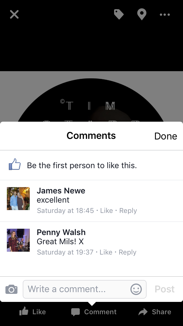
By using social media sites such as iMessage and WhatsApp, I asked a selected few to give me feedback on my final product by including questions regarding my music video in the message that I sent. Due to the controversy of my music video, I decided only to send the video link to a few people who would appreciate the narrative and take the video seriously. I used my phone to send the message to my target audience.

FEEDACK

As you can see I have gained some audience feedback form the message that I sent out to my target audience.
 From the audience feedback that I have received it is clear to that I have successfully conformed the psychedelic genre and style, which was one of the main goals for my music video.


Saturday, 23 January 2016
DIGI PACK SKETCHES AND AUDIENCE FEEDBACK


Here are the sketches for the digi pack.

FEEDBACK VIA MESSAGE GROUP CHAT


Friday, 22 January 2016
RE-THINKING AND CHANGING MY DIGI PACK DESIGN.
After editing my dig pack front cover, I have decided that I do not like my idea. I started to play around with using the retro font, and decided that it was beginning to look dated and very unattractive. I have decided to rethink my idea completely as I do not feel that the cover looks as if it represents my artist in an appropriate way.
 So I have decided to go back to basics and re think and re design my ideas for the dig pack and poster. I will be changing the font design of my dig pack and possibly the main image. The overall look of the font was beginning to draw the attention away from the artist, so I have decided that I am going to use a more simpler font, I feel that this will enable the audience to focus on the facial expression of the artist. As you can see I am now debriefing by drawing sketches and referring back to my past blog posts to gain inspiration.
 So I have decided to go back to basics and re think and re design my ideas for the dig pack and poster. I will be changing the font design of my dig pack and possibly the main image. The overall look of the font was beginning to draw the attention away from the artist, so I have decided that I am going to use a more simpler font, I feel that this will enable the audience to focus on the facial expression of the artist. As you can see I am now debriefing by drawing sketches and referring back to my past blog posts to gain inspiration.
Thursday, 21 January 2016
WHERE AM I AT NOW? RECAPPING...
Now that i have planned what my digi pack is going to look like I am now in the process of creating my digi pack on photoshop. I have used photoshop in AS, however after not using photoshop for almost over a year now I feel that I am out of touch. I will be using youtube videos to help me recap on how to use photoshop in a professional way. In my spare time I frequently use film editing softwares such as final cut and imovie, therefore in the process of my music video I found that I was progressing quickly and in more of an efficient way.
In the next few posts I am going to be posting my progress of editing my digi pack and poster, I will be updating my blog every so often to suggest all the different types of editing techniques that i have ;earnt using photoshop.
In the next few posts I am going to be posting my progress of editing my digi pack and poster, I will be updating my blog every so often to suggest all the different types of editing techniques that i have ;earnt using photoshop.

Deciding on a font to use for my Digipack
As the font that I will be using for my digi pack will be playing a huge part on the front cover of the digipack, it is important that I use an appropriate font that will relate to the star image of my artist and attract the attention of the audience.


 From the post that I posted on my facebook, I have received many suggestions regarding which font that I should use for my digi pack. The majority of the feedback suggested that font B was the most successful due to its clarity and boldness. Other feedback suggested that the other fonts did not relate to the style of the artists genre, or other fonts were more difficult to read.
After gaining feedback from face book, I have started to plan on how I can make the font that i am going to be using unique and adapted to my digipak style. Font B shows a psychedelic style which relates to the psychedelic genre of my artist, i have decided that I am going to create a psychedelic style for my digipak front cover. This will be appropriate for my artists genre and style persona, due to the albums name, 'Sanity of A Different Kind', a psychedelic style will suit the star image of the artist, appealing to the target audience.
By using social media sites such as Facebook, i am able to gain feedback efficiently on the font type that i should use.
FEEDBACK
After gaining feedback from face book, I have started to plan on how I can make the font that i am going to be using unique and adapted to my digipak style. Font B shows a psychedelic style which relates to the psychedelic genre of my artist, i have decided that I am going to create a psychedelic style for my digipak front cover. This will be appropriate for my artists genre and style persona, due to the albums name, 'Sanity of A Different Kind', a psychedelic style will suit the star image of the artist, appealing to the target audience.
Thursday, 14 January 2016
PLANNING FOR MY ANCILLARY TASK
When previously filming for my music video, I also took some images of my artist to use for my ancillary task for future use. After looking and reviewing the images that I took I have decided that I am going to use one of the images and create a surreal image to use for my digi pack and poster to relate to the style of the artists and album.
From the images that I have taken I plan to use for my digi pack and poster. I have taken photos pf my artist in the same setting and location as the music video, wearing the same clothing and make up etc. This will show a link between both my music video and ancillary tasks, which is a typical convention in the music industry including marketisation and advertising.
CONSIDERING THE LIGHTING
From the images I have taken, I like the way the lighting enables the audience to focus on the artist. The black background and harsh lighting focusing on the artists reflects the importance oif the artists and the significance that they have according to the record. It is clear to see that the images i have taken are low-key lighting images, as they show high contrasts, which means a good white as well as plenty of blacks. Low key refers ri a style of photography that utilizes predominantly dark tones to create a dramatic looking image, which i have achieved in the images shown. To create these images i have used the same lighting and setting that I used in my music video, in the process of taking the photos i had to consider shadows as the primary element of the composition, one that defines the mood of the entire photograph. Then manipulating the lighting and positioning of the artist, this way the shadows fall in the right places, creating a main focus being the artist.

The low-key lighting relies on shadows, deep blacks and darker tones, with very few whites and middle tones, creating a mysterious and moody tone, dramatic or even ominous, identifying the artists face and no other objects or setting.
As the back ground of the images are of a solid black colour, I feel that I could take advantage of this and create a piece of artwork or illustrations that I could place on the digipack, ultimately creating a piece of art that my target audience will be interested in. By including illustrations and symbols as well as the artist combines the two main conventions of a digipack, as shown in my previous research studies on digipacks.
THE ARTIST PERSONA AND STAR IMAGE
In my music video the artist shows a distinctive star image and persona of insanity and madness. When I taking photos for my ancillary task I wanted to also show this particular persona. I made my artist act reflect their persona to me and began to take images. The artist, sometimes shows a black expression reflecting his feeling of insanity and numbness. The artist shows direct eye contact with the camera which will effectively have an affect on the audience, as they will feel more connected whilst helping the audience to concentrate on the significance of the artist. The artist therefore, is directly addressing the audience creating an impact on both, the audience and the digi pack's significance.
The shadows of the image help to contribute to the artists persona. The shadows covering half of the artists face suggests a secret or hidden identity, relating to the meaning of the album and the tracks on the record. This term is often referred to as, 'chiaroscuro', an italian artistic term to describe the dramatic effect of contrasting areas of light and dark in an artwork, particularly in paintings.


However this technique can be used in film and media to connote a sense of secrecy and mystery. The face half covered by a shadow, is a good way to emphasize a character's sinister side, this can also overlap with hidden eyes which is seen in some of the images that I have taken.
The shadows of the image help to contribute to the artists persona. The shadows covering half of the artists face suggests a secret or hidden identity, relating to the meaning of the album and the tracks on the record. This term is often referred to as, 'chiaroscuro', an italian artistic term to describe the dramatic effect of contrasting areas of light and dark in an artwork, particularly in paintings.
However this technique can be used in film and media to connote a sense of secrecy and mystery. The face half covered by a shadow, is a good way to emphasize a character's sinister side, this can also overlap with hidden eyes which is seen in some of the images that I have taken.

In the image where the artist has his hands held out in front of him, directly addresses the audience whilst portraying a sense of hysteria and madness. I feel that this image could bring up a lot of questions as to why he is
holding his hands in a certain way, whether it may have some significant or just solely due to the fact that the artist portrays an insane star image. Half of the artists face is completely covered in this image which, as i have just discussed represents a sense of secrecy creating a sinister atmosphere.

I have taken the images as profile shots as i feel that this enables the audience to focus on the character of the artist, allowing the audience to understand the importance of the star image and personality. It is also important to note that my artists main feature is not only their music but their star image and personality which helps to intrigue audience's into purchasing and investing in the artists work.


Subscribe to:
Posts (Atom)